An end-to-end app design to connect users to friend groups nearby
Role
UX/UI Design, Research, Branding
Timeline
4 weeks sprint, 2023
project background
Groops is designed for users to find friend groups near them with similar interests and experience desires.It is a concept born from the need for people to feel less lonely and connect in person with groups of like minded people.This app is perfect for young people 18-40 who often travel, are new to a city, or simply want to meet new people nearby. This is a fictitious design I tackled to get experience designing customer facing mobile applications.
Learning through empathy
I wanted to learn more about users methods of meeting new people, and what their pain points might be around doing so in order to ideate a product that people would find useful. I was especially interested in their use of technology to meet new people in real life, and any habits and concerns they might have while doing so.
Research Methods
User Interviews
Peer Analysis
Understanding users through interviews
I interviewed 5 people who were known to use technology to meet people in real life (dating apps, Airbnb, etc).They often traveled, and some had moved from other countries or states.
I asked questions about their experiences meeting new people on their own, and using technology to meet new people – including any safety concerns they might have in doing so.
Interview Insights
Our users were either very shy to start conversations with strangers, or very free spirited and trusting.
Meeting new people is almost always influenced by proximity and shared interests.
Some pain points around meeting new people included:
Being able to work up the courage to start a conversation with strangers
Finding common interests or being compatible with people they do talk to
Their efforts to talk to people not resulting in meaningful connection
Fear for their safety while meeting people offline (mitigated by meeting people in populated, public places)
Analyzing how peers solve similar problems
I took a look at how apps designed to bring people together from online into the real world handled the task.
Tinder
Many people use Tinder to meet new people near them, either romantically or not. I’ve personallty used it to make friends while traveling, but am also wary of peoples’ intentions on the trendy dating app.
I looked at Tinder because I wanted to investigate how they went about connecting users who were located near each other and the ways they went about gaining user trust and keeping users safe while doing so.
Bumble
i knew for an app to work well in bringing people together successfully, it would have to contain some kind of algorithm to match best-fit people (solving the problem of compatibility and common interests).
Bumble dating had an extensive onboarding process to get to know users so that their algorithm could give them more compatible matches.
GroupMe
I wanted to connect groups, so I needed to learn how they might be interacting with each other on the app and what features might be available for them. I’ve used GroupMe in the past, and figured their chat feature would have tools simple enough to use while in a group chat.
DEFINING NEEDS AND DESIRES
How might we facilitate the desire of free spirited people to meet new friends when they’re on their own?
How might we help introverts strike up conversations with strangers?
How might we help make people feel comfortable meeting like minded people from an app?
Developing Personas to keep our designs human centered
I had two key users: an extrovert and an introvert. I also had two modes of use: while traveling, and where someone lived.
I wanted to account for these variations during the design process, so I created two differing personas.
Lana The Extrovert
Lana is an extroverted, traveling digital nomad who finds herself in a different city every few weeks. She thrives off social interaction, but most of her time is spent working and traveling solo.
She often feels lonely on the road, and overwhelmed with work.
She needs to make quick friends and connect with people in the cities she’s traveling to in order to let loose and forget about work.
Eddy The Introvert
Eddy just moved to Atlanta from a small town to advance his photography career. He’s soft spoken and shy, so meeting new people can be a challenge.
He doesn’t know the best spots to hang out in Atlanta, is starting to feel lonely in his new hometown, and wishes he could feel more confident talking to new people.
He’d like to make new meaningful connections in Atlanta, and learn to get out of his shell and try new things around town.
Prioritizing design features
User Driven Connections
I wanted users to feel freedom while making friends with their Groop. I felt a chat room system would work best to give users the opportunity to collaborate and communicate with their Groop on where to meet up.
An Informed Algorithm
Users main concern when meeting new people was whether or not they’d have common interests or energies. I knew I had to include extensive data collection on every users’ preferences when it came to their lifestyle and interests.
Instilling Confidence
Users wanted to come away from their Groop interactions feeling good about their meetings, and have options of what to do if not. Photo verification, user rating systems and the opportunity to continue chatting after a real life meeting where all important.
designing an app for friendships
My goal was to design an app that would instantly create connections between like minded people nearby, in hopes they’d meet up in real life and create lasting friendships.
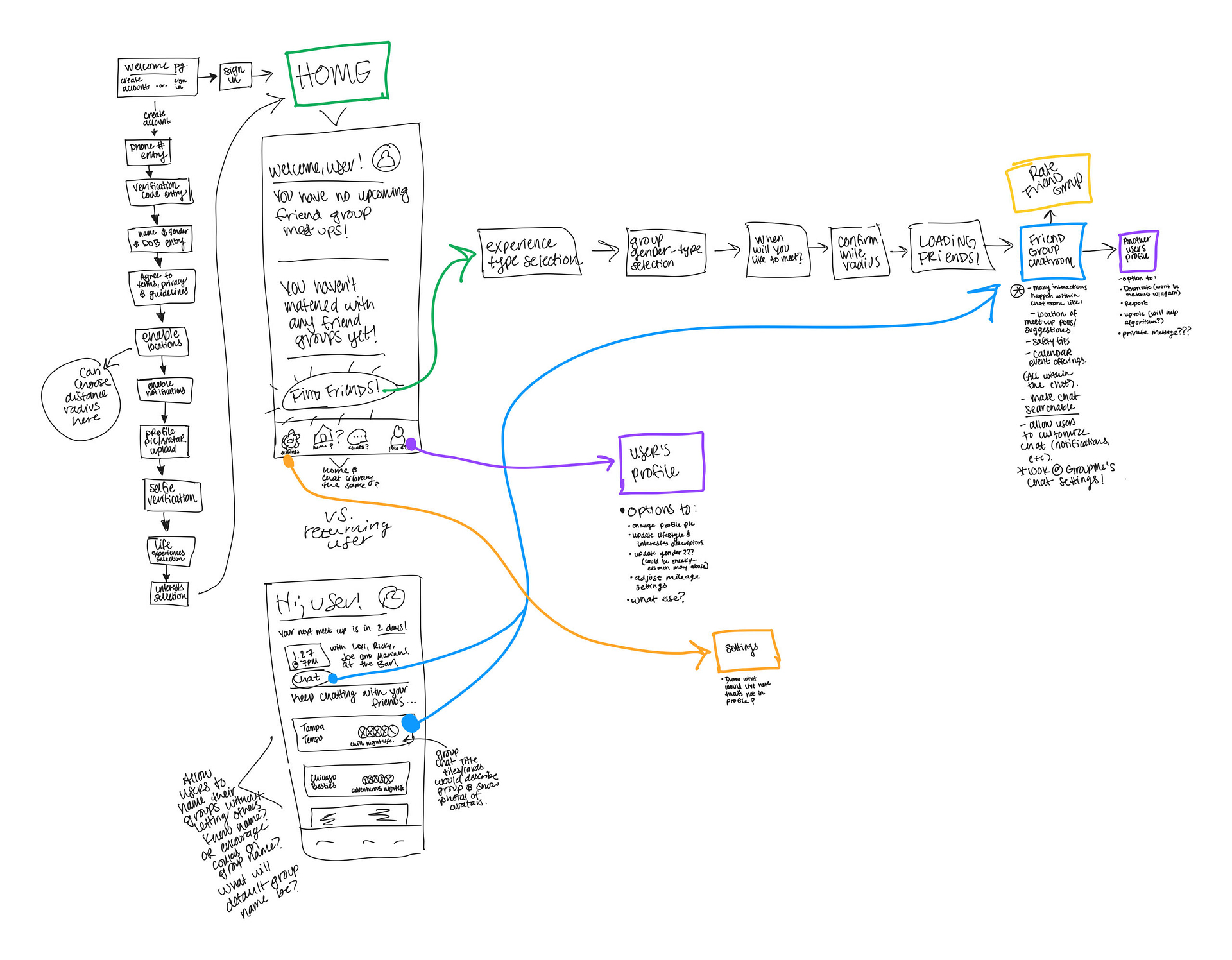
Sketching flows for better clarity
I explored how the app might work based on the users’ journey from onboarding to finding a Groop.
I find that sometimes this more organic, sketched out thinking provides better results than a structured, linear deliverable.
Before going to the next step and creating wireframes, I wanted to tackle Groop’s look and feel in branding.
CREATING AN INVITING BRAND
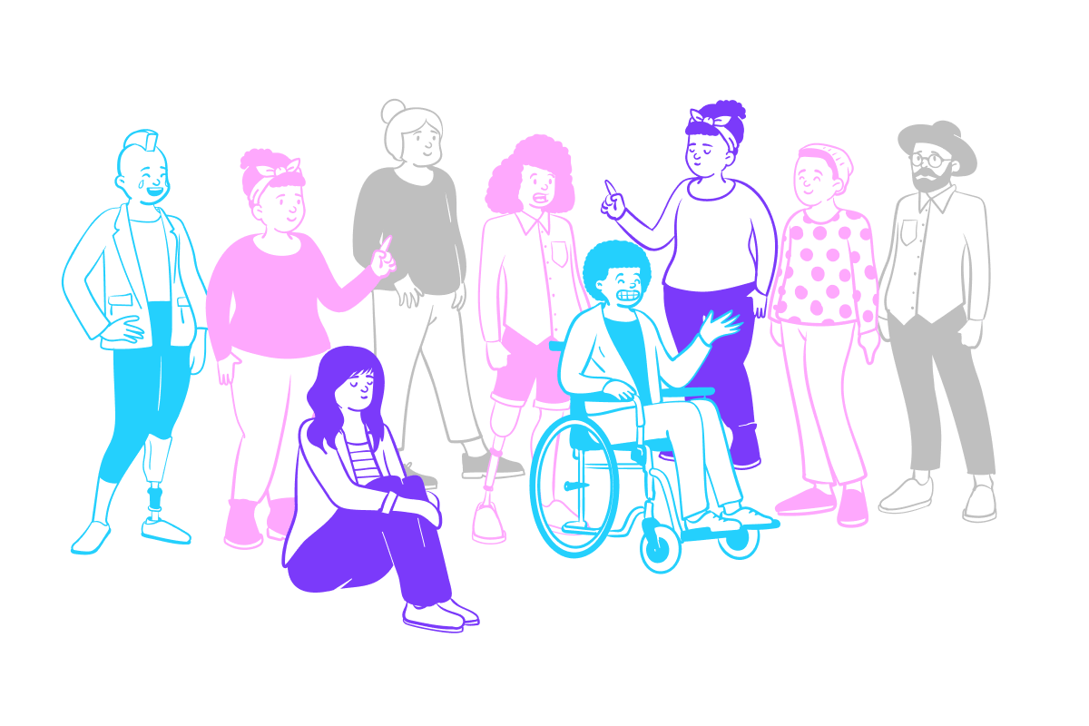
Groops needed to cater to an audience seeking connections, adventure and friendship. I wanted the UI to be simple, easy to use, and focused on the Groop chats.
Modern & Simple Inviting & Friendly Safe & Trustworthy Fun & Adventurous
Designing a logo
I created a logo that was clean, modern and fun. We could adapt the icon mark into a home page button, and more!
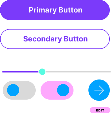
Developing a new UI Style Guide
I created a color palette that would feel youthful and adventurous and kept the UI elements simplistic.
CREATING the product
I now had all the pieces to build the product. It was time to start constructing this app.
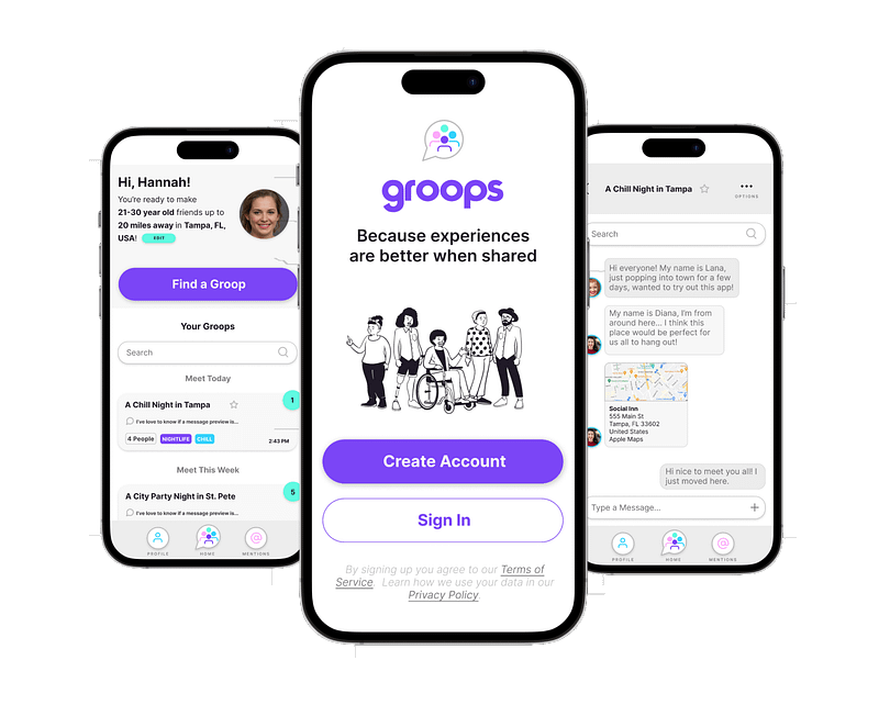
I created screens for this minimum viable product that I’d use for usability tests, including the homepage, on boarding flow, profile and chat features.
Designing a dynamic onboarding flow
The onboarding flow would be crucial to the app’s success, as this friend group finding app needs user data to match people with the best friends.
Easily get matched with a friend group
The main function of the app is to match users with a group of like minded individuals nearby so they can meet up in real life. This is the flow in getting into a Groop chat from the homepage.
A profile fit for a social app
The profile would contain everything from the onboarding flow in case users wanted to refine their interests later.
checking our design with usability testing
I did in person usability tests of four tasks, recording user narration, questions, feedback and follow up questions.
Quantitative data included error percentage and time taken per task, and qualitative data included our users thoughts and opinions while conducting the test.
Task 1: Successfully onboard in a reasonable amount of time
Task 2: Create a Groop and use the chat features like adding a photo or attachment, and finding the chat options
Task 3: Report a user and leave a Groop
Task 4: Find and update your profile
Usability Testing Insights
Our users were either very shy to start conversations with strangers, or very free spirited and trusting.
Meeting new people is almost always influenced by proximity and shared interests.
Some pain points around meeting new people included:
Being able to work up the courage to start a conversation with strangers
Finding common interests or being compatible with people they do talk to
Their efforts to talk to people not resulting in meaningful connection
Fear for their safety while meeting people offline (mitigated by meeting people in populated, public places)
PRIORITIZED ITERATIONS
Accessing the chat options was the only test that truly failed, so this iteration was the most important.
We removed avatars from the title space, and added a labeled icon for the chat options.
I made some small adjustements to the Choose your experience screen to make the slider options look less clickable. I also added another option, Professional or Leisure, per a user’s suggestion.
Instead of having arbitrary options of when to meet up, I gave users more control and allowed them to pick date ranges on a calendar.
Another small iteration, I altered the prototype to allow test users to be able to actively click options on/off.
I also set numbers for group size so users would know explicitly how large or small a group they’d be choosing.
FINAL THOUGHTS
I am interested in the logistics of creating friend Groops that may not appear instantaneously, but take hours or days to create.
Realistically, there may not be enough users inputting similar Groop searches to make a Groop chat in a very short period of time. Instead, a user may input their Groop criteria, and be shown a page asking them to hold tight while their Groop is made.
Depending on the nature of the user’s criteria, they may not find a group in the reasonable amount of time they’d like to meet with them, and have to try searching with different criteria. This could be based on how far out the began their search, and how specific their search criteria is.
While it was out of scope for this 4 week design sprint, I’d be interested in iterating on this concept in the future.
Possible solutions might include a “Random” Groop option for users who are pressed for time, which might sort them into a Groop that’s more flexible, but more immediate. Users with specific asks from Groops might benefit from smaller groups, or more time from Groop Request to Groop Meeting Date.
I’d also love to expand on how to keep users safe with things like suggested meet up locations that are populated and public, as well as other verification and safety measures to ensure safety and instill trust.
Very lastly, I would explore ways to retain and guide users through the lengthy onboarding process. I’d ideate ways to do this by utilizing dopamine creating text and images that would make the users anticipate the reward of finding a Groop of like minded people to connect with.
Every month I release a newsletter on the new moon. Sign up here to receive public art updates, new releases, merchandise, invites to exclusive art events and more!