Building a responsive, user focused website for a small business
Role
UX/UI Design, Research, Branding
Timeline
4 weeks, Winter 2022
project background
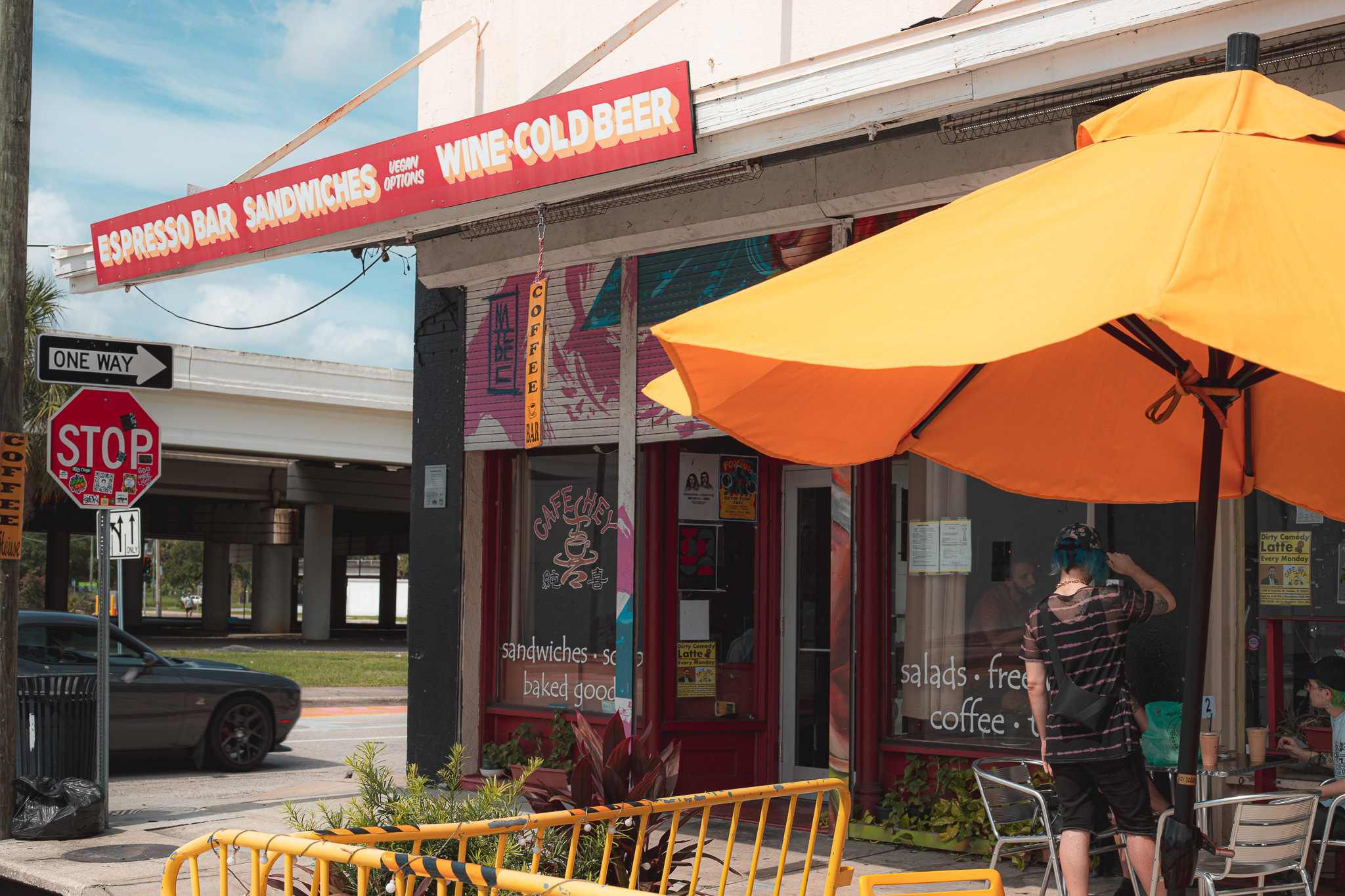
Cafe Hey serves sandwiches, coffees and teas to diverse clientele in the downtown Tampa Heights area. They foster a tight knit community and have many regulars after being in business serving vegan friendly fresh breakfast and lunch options since 2007.
They’ve mainly been using their instagram to communicate with their customers, and did not have a valuable website of their own at the time of us coming on to design for them.
Their customers needed an easy way to access their menu online to better order on the go, as well as learn about the cafe’s events.
The business wanted to capture email subscriptions and increase phone and online ordering sales.
Learning through empathy
I wanted to know who Cafe Hey’s customers were, how their peers and small business restaurant competitors offered to their customers, and what the cafe’s current web presence conveyed to their users.
Research Methods
User Interviews
Peer Analysis
Web Audit
Understanding users through interviews
Before ideating on solutions, I got to know Cafe Hey’s users (customers) in interviews at the cafe itself.
I talked to four people to dive deeper into:
What their values were
What their processes for choosing where to eat were like
Their overall thoughts about Cafe Hey and what makes them be a patron
Their experiences online with Cafe Hey or similar businesses
What their pain points were with the cafe or similar businesses or in person or online
Interview Insights
Customers choose Cafe Hey because they’re frequently on the go and value vegan friendly options and supporting local art and small businesses.
Our users had needs like being able to access an online menu, fast online ordering and learning about events.
Their website needed a complete redesign to make it valuable to their customers and their business combined.
Analyzing how their peers solve similar problems
I also wanted to take a look at what other food businesses did to solve similar problems, and peer reviewed 5 similar businesses to see what design patterns they were using.
Peer Review Insights
We uncovered that having professional photos, a full menu and prominent online ordering calls to action were a must on a cafe business website.
Using social media and social proof like Google reviews was common.
I learned what important info to provide, like hours of operation, contact info and email subscription forms.
Most importantly, I learned that many competitors outsourced their online ordering to third party apps like UberEats.
current Web Audit
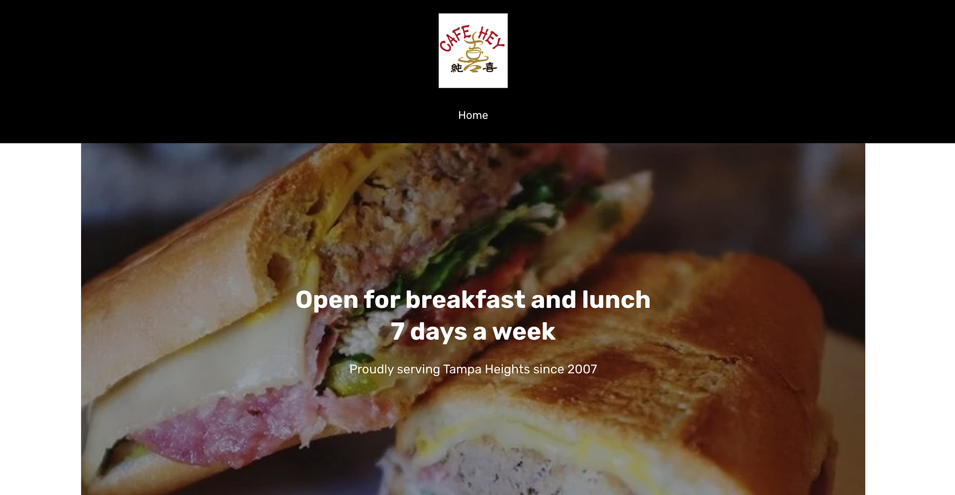
Looking at their existing website
Their one page website is built using Square Site, and is lacking information, a menu or professional photos. They include an email mailing list sign up, but don’t inform users of what they’re signing up for.
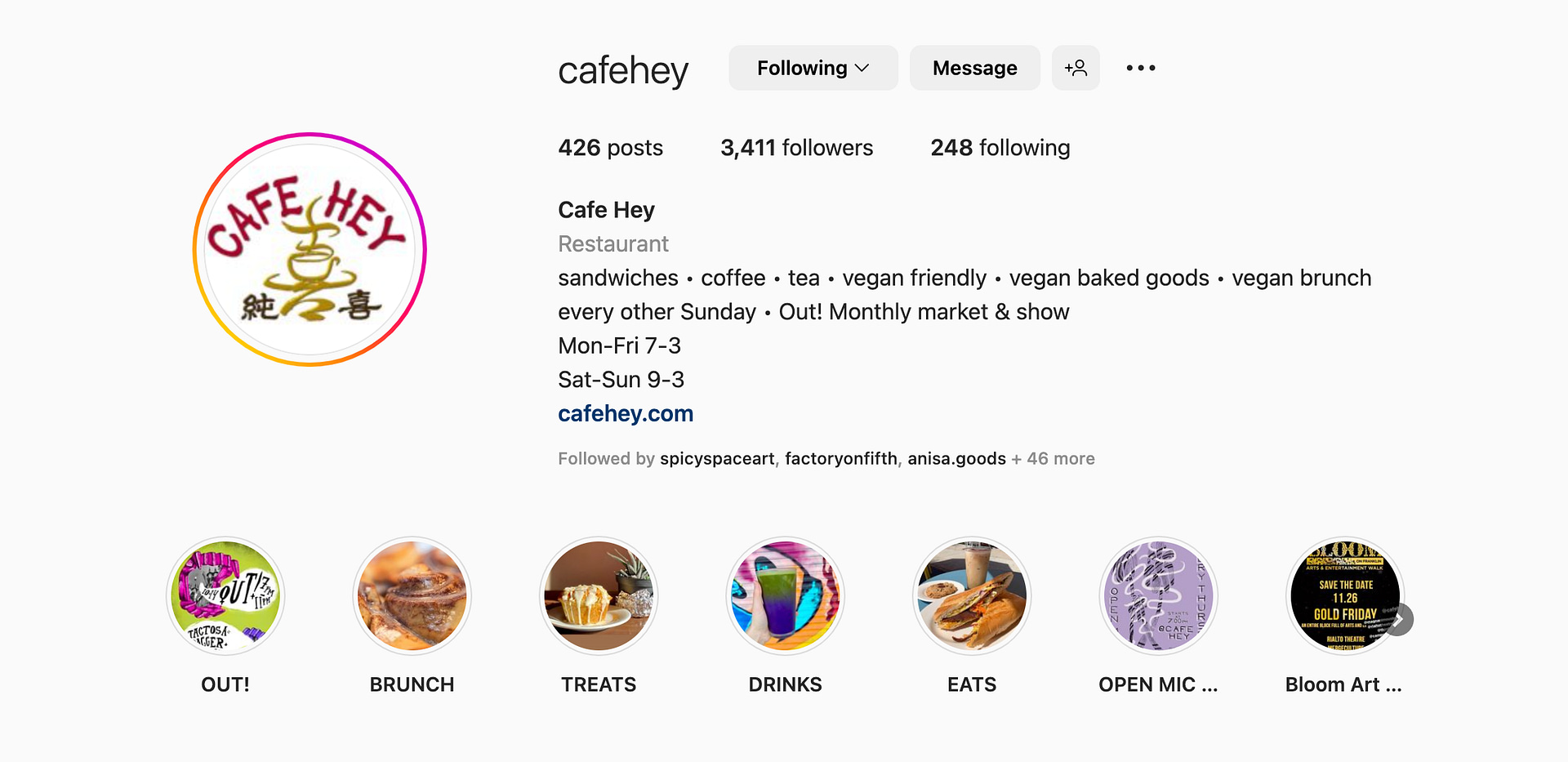
A stronger social media presence
Their instagram had good photos of their products on their page, and informed users of special events before they occurred. This was their strongest representation online.
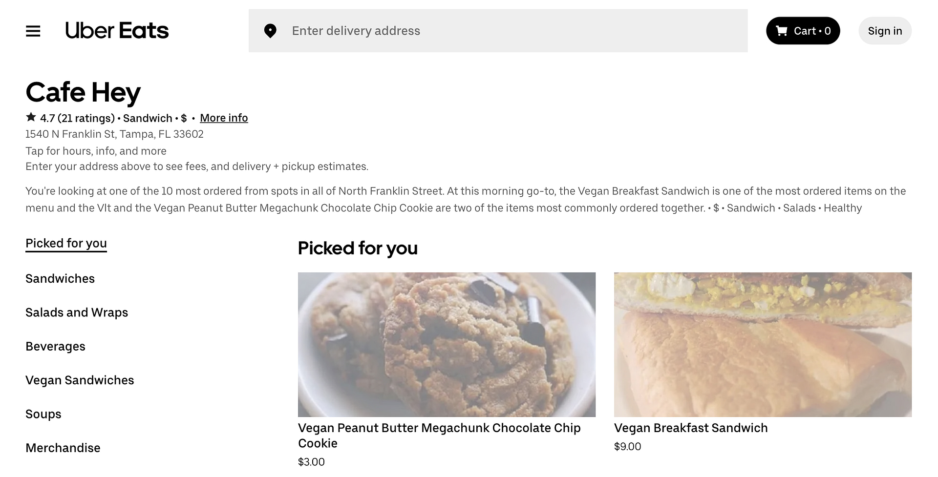
UberEats informs the internet about their menu
This is the only place online where you can find most of the Cafe Hey menu. There was more of their menu offered on UberEats. I chose to focus on promoting UberEats in my design since it contained a more complete menu.
NEXT STEPS
I had a thorough understanding of what Cafe Hey’s customers’ preferences were when it came to a their experience with food establishment websites, including their pain points around them.
I also had a deeper understanding of Cafe Hey’s limitations online, and limitations in the future when it came to updating their website. This would inform what I would build moving forward.
prioritizing features based on needs
With my research conducted, I knew we needed to design a responsive website that would meet both the users’ and the business’s needs.
A menu would be a must on both accounts, as well as prominent CTAs directing users to UberEats to order food, as well as a CTA to call the cafe while on mobile to place an order that way.
Users would appreciate event information, and the business might see more turn out on those occasions and make more sales with them advertised clearly.
A mailing list subscription would engage users directly with the business and have them coming in for specials and events.
designing a small business product
Certain constraints exist when designing for a small business. Ultimately, my client is the business, and while I can advocate for the users, I realize that small business owners are busy people that may have minimal time to update their websites.
With this in mind, I had to come up with a functional, responsive website that could meet customers half way, while still accomplishing to enhance the business’s goals. Here’s what I did to accomplish that.
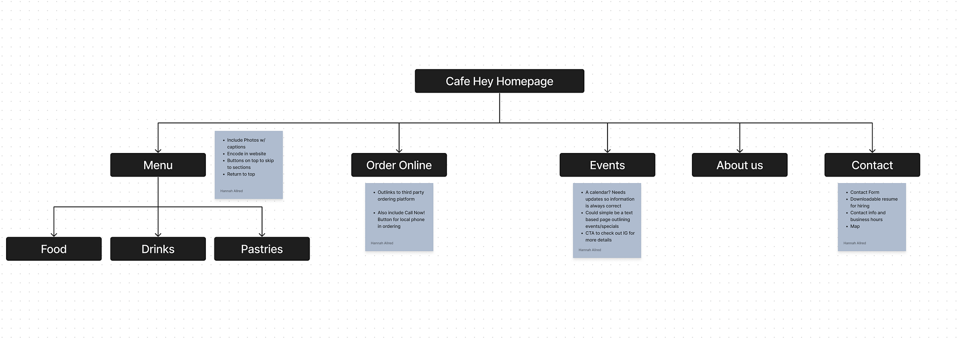
A Site Map will inform Information Architecture
I set out developing a site map to build Cafe Hey a web page that contained all the information their users needed.
User flows and Task flows show interactions
Some user flows showed processes users might take navigating the menu page to eventually order food, and how they might find more information on events.
I learned shortly after this phase, that the business owner was not likely to update their information page, so we adjusted our design to simply advertise the events instead of house a calendar, linking to social media pages so users could learn more about the events.
Low Fi Wireframes laid everything out
I created a few different iterations of wire frames to determine the best hierarchy and placement of the web elements. I made sure to create frames for both mobile and desktop experiences.
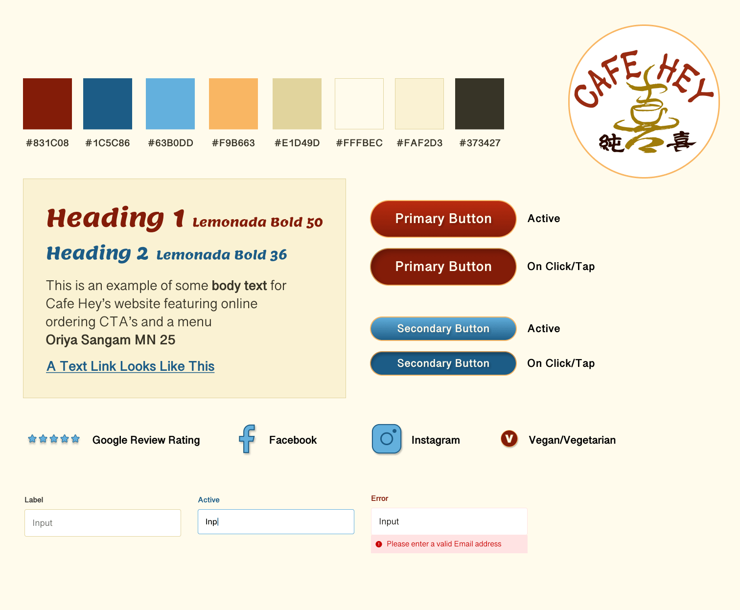
refreshing A small biz BRAND
I knew the color yellow and red were important to our client, but also knew their brand needed a fix up!
I set out to make a new, fun brand for Cafe Hey’s redesign, utilizing what I had gleaned from what their customers’ valued in my research.
Promoting Authenticity
Locally DIY
Supporting Community
Always Fresh & Delicious
Catering to Vegan Eaters
Developing the UI
A bright red and yellow caught my eye after iterations with more conservative color choices.
I stayed true to Cafe Hey’s colors of choice while embracing the “Ketchup and Mustard” theory of color combinations – a calming yellow and a more impulsive, hunger inducing red.
The second iteration, getting closer.
The first try, still too dated.
Copywriting
I wrote copy to inform users about Cafe Hey during their web experience. It put the cafe’s unique business value front and center to appeal to both new customers and regulars.
It was inviting, and encouraged users to learn about the Cafe’s specials and events via an email subscription. I also made sure to translate their entire menu into an accessible text based menu page.
CREATING A HIGH FIDELITY PROTOTYPE
I now had all the pieces to build the product. It was time to start constructing this small business design.
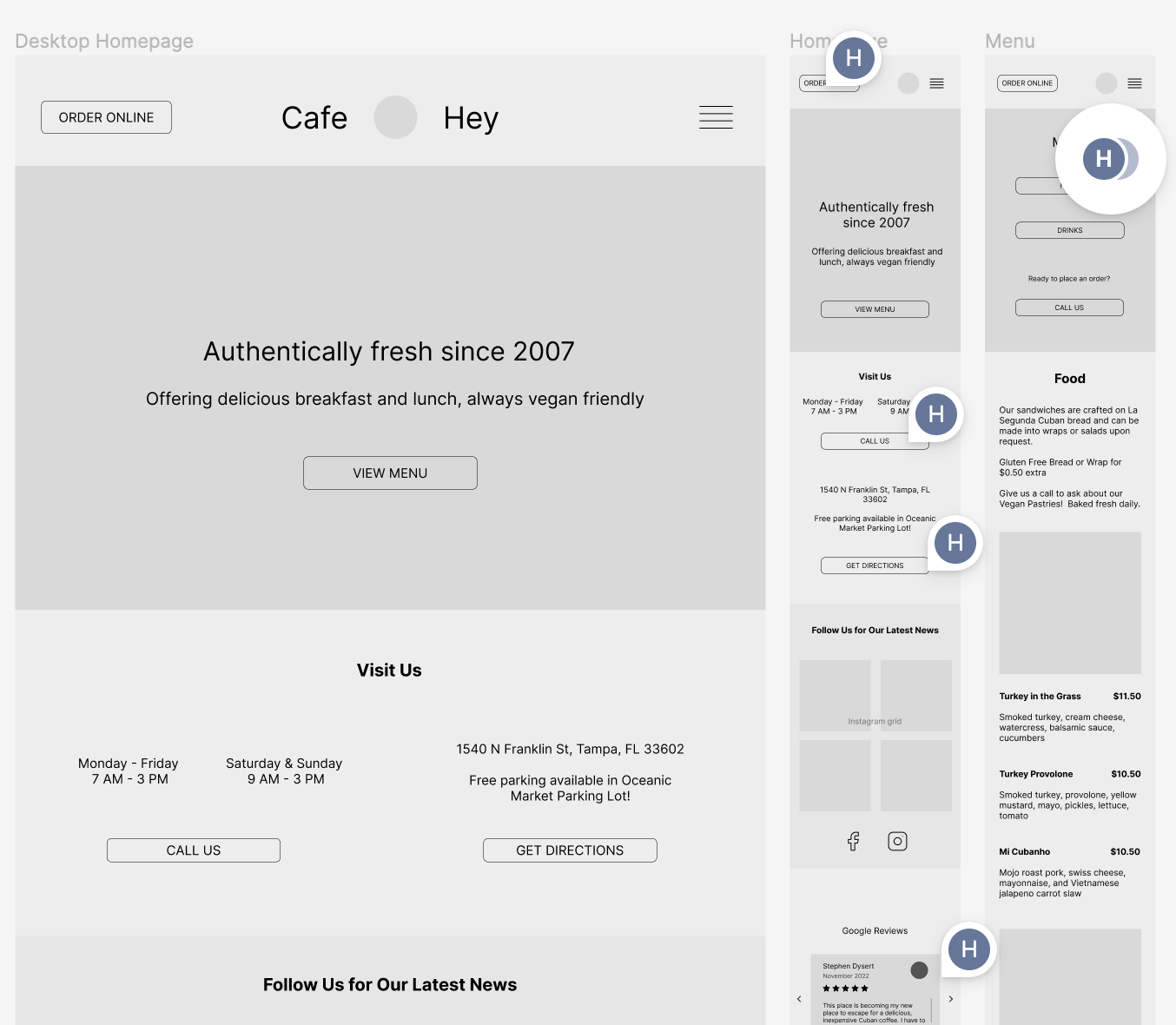
I created a prototype featuring the homepage, menu and events pages in order to test with the cafe’s customers.
A desktop website that was useful to users and promoted more sales
The new homepage makes use of CTAs for users to order online and see the full cafe menu.
They can also sign up for the cafe’s newsletter, and see google reviews.
A mobile friendly website with sales generating CTAs
I made sure to include a sticky footer banner for customers to be able to call the store, while a sticky header banner informed them of business hours.
checking our design with usability testing
My task-based in person usability tests set out to test the prototype’s success in the menu, events and mailing list subscription designs.
I determined the pass/fail of the tasks based on time over 30s and errors over 1. Errors were characterized by the number of deviations within expected flow of the task.
Task 1: Find ingredients in a food item.
Task 2: Identify 2 events happening this month
Task 3: Locate a specified drink item.
Task 4: Locate the mailing list sign up form.
Usability Testing Insights
We knew our food menu and event designs were working well.
The drink menu needed revision since users took too much time to locate the drink item, and found themselves confused and overwhelmed while using it.
The mailing list sign up hierarchy needed to be elevated to get more user engagement.
PRIORITIZED ITERATIONS
We re-arranged the drinks menu so most-ordered drinks appeared before more niche, specialty drinks.
I would reccomend to the business owner to further condense the drinks menu to avoid repeated items under “hot” and “iced”.
I added a modal pop up for the mailing list so it was impossible for users to miss.
FINAL THOUGHTS
Before moving into the development phase of the cafe’s responsive site, we wanted to recommend the business considering some further changes.
The drinks menu could be condensed down, eliminating Hot and Cold drink options and instead showing only one option with hot and cold options in the description of all drinks. This would reduce a lot of confusion and overwhelm while the user reads through all the other great drink options.
I’d also recommend the cafe have more professional photos taken of their menu options to share with their audience, since photographic evidence was great to incentivize users to order and eat delicious looking food.
I think these changes would greatly enhance their users’ experience of their business online as well as in person, and lead to more sales.
Every month I release a newsletter on the new moon. Sign up here to receive public art updates, new releases, merchandise, invites to exclusive art events and more!