Designing a new user centric brand and responsive website for a music and arts festival
Role
UX/UI Design, Research, Branding
Timeline
5 months, June – October 2023
project background
Bloom is a music and arts festival on historic Franklin Street in downtown Tampa, Florida. Their goal is to facilitate events that bring their community together with music, art and market vendors.
I first got involved with Bloom as a live painter, then as a live artist coordinator. I volunteered to help guide their brand into a better user experience for everyone involved.
Their business problems involved being able to scale their brand to facilitate growth of their events, both on and offline. They predominantly interacted with their audience via Instagram, but wanted to use their website to create brand recognition and generate more attendance and ticket sales. My goal was to help them meet these measures, and more, by implementing a user centric strategy.
Along with designing their future website, I helped the team on the ground to operate their events from their users’ perspective, rebranded Bloom from an art-walk to a festival, and created a user-focused social media marketing campaign that helped grow their instagram reach by over 100%, leading to record ticket sales for their 2023 season.
Learning through empathy
I wanted to know what I could offer Bloom’s users to encourage greater attendance, participation, ticket sales, and positive reception of Bloom on Franklin events.
I chose to talk to Bloom’s audience directly, and also took a look at what other festivals did to cater to their audiences.
Research Methods
User Interviews
Competitive Analysis
Affinity Mapping
Card Sorting
Understanding users through interviews
To gain insight into the needs of Bloom’s users, I conducted 8 interviews with individuals who regularly attend music and art focused events. During these interviews, I asked open-ended questions to understand their experiences with music and art festivals.
By doing so, I was able to identify the key aspects that have made their past experiences enjoyable, as well as any pain points they may have encountered. This would be the basis on what I would work off of when it came to ideating a user-focused strategy for Bloom’s website, social media presence and live events.
Interview Insights
Users need access to key information before and after events, including a map, a lineup, and details about artists and musicians.
Users desire diverse activities and options in mood and setting within a large event space.
Social media is a primary tool for users to discover and share information about events with friends.
Users experience pain points around event logistics, such as parking, lack of communication between organizers and attendees, and overselling of events in marketing.
Users appreciate notifications about events, delivered via email or text, to help them remember and plan to attend.
Users value opportunities to connect and build relationships with other attendees, as well as with musicians, artists, and vendors at the event.
Analyzing how Bloom's peers solve similar problems
After completing my user interviews, I took a look at how similar events interact with their users online.
I looked at another monthly market event in South Florida, a festival SaaS that provided apps for large scale festivals, and a website for Clearwater Art Alliance’s art walk.
Peer Review Insights
Many other local events like Bloom relied on social media to give up to date information to their audience/users
Competitors were offering information on details such as: schedules, interactive maps, artist and vendor biographies
Music and art events similar to Bloom on Franklin are often using visually striking and colorful fliers and graphics in their web and print presence
Competitors utilized methods like email newsletters and mobile notifications, whether from a mobile application or via text messages
Competitors utilized sponsors on their platforms to increase sponsor-audience relationships and increase revenue
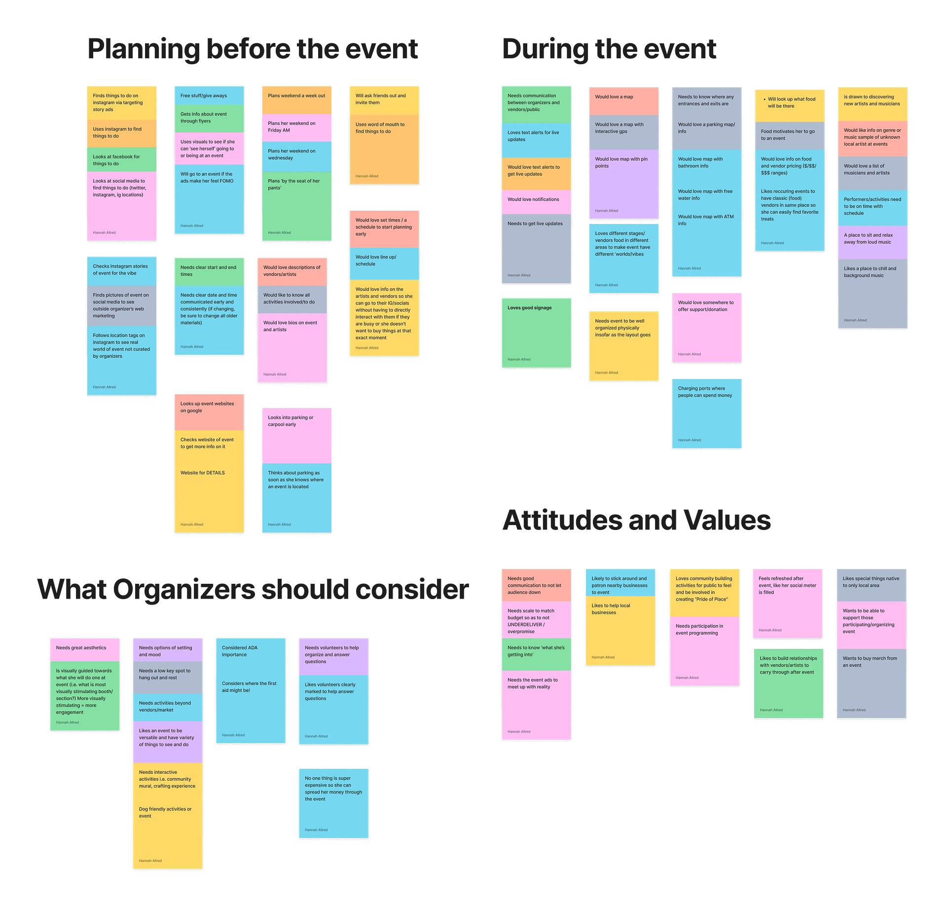
Mapping out the data
I grouped the data from the peer analysis and user interviews into an affinity map to find common user challenges and desires when it comes to attending a music and arts festival.
This data showed what made an event special and memorable, which is something the Bloom team found valuable for their event as a whole.
These clustered topics would inform the kind of content I’d focus on when building this product for Bloom.
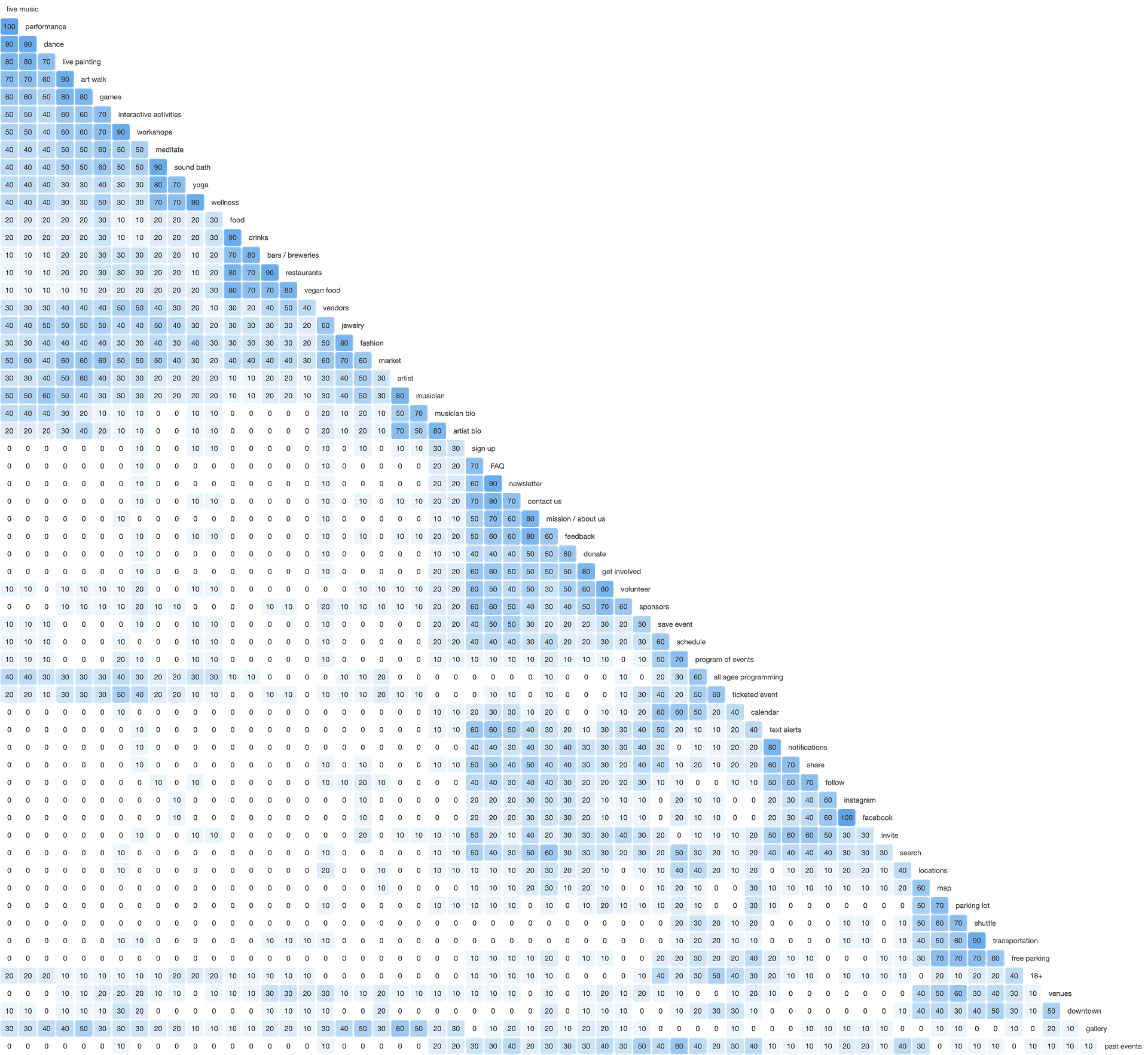
Card sorting reveals users' mental models
I conducted an open card sort with 10 participants through Optimal Workshop of 60 on-brand topics I gathered from my affinity map clusters and what already existed on the Bloom website and social media. I did this to get a better idea of how I might organize the information that would be found on Bloom’s website for ease of use and recall for the users.
This would be helpful in the Information Architecture phase of the project.
This affinity diagram showed how related all the topics were to one another, which gave me a good idea on how to group them in the site’s architecture and navigation.
NEXT STEPS
Doing research on a music and art festival was so fun! I learned all about Bloom’s audience, including their preferences surrounding events and what they valued in festivals, as well as their challenges when it came to attending an event like Bloom. That data would be invaluable in the rest of this design process.
Now that the data was organized, I could extrapolate specific problems and needs for the users, and define exactly who I’d be designing for.
DEFINING NEEDS AND DESIRES
Once the research was done, I needed to clearly define the users’ needs based on my insights, and pose them in a way where I could start ideating solutions for those problems, all while meeting the festival’s needs, too.
How might we facilitate the desire of adventurous fun seekers to experience a versatile, diverse festival experience?
How might we help socialites who go out on the weekends easily find all the information about an event?
How might we help community driven people support local events and artists with their time and money?
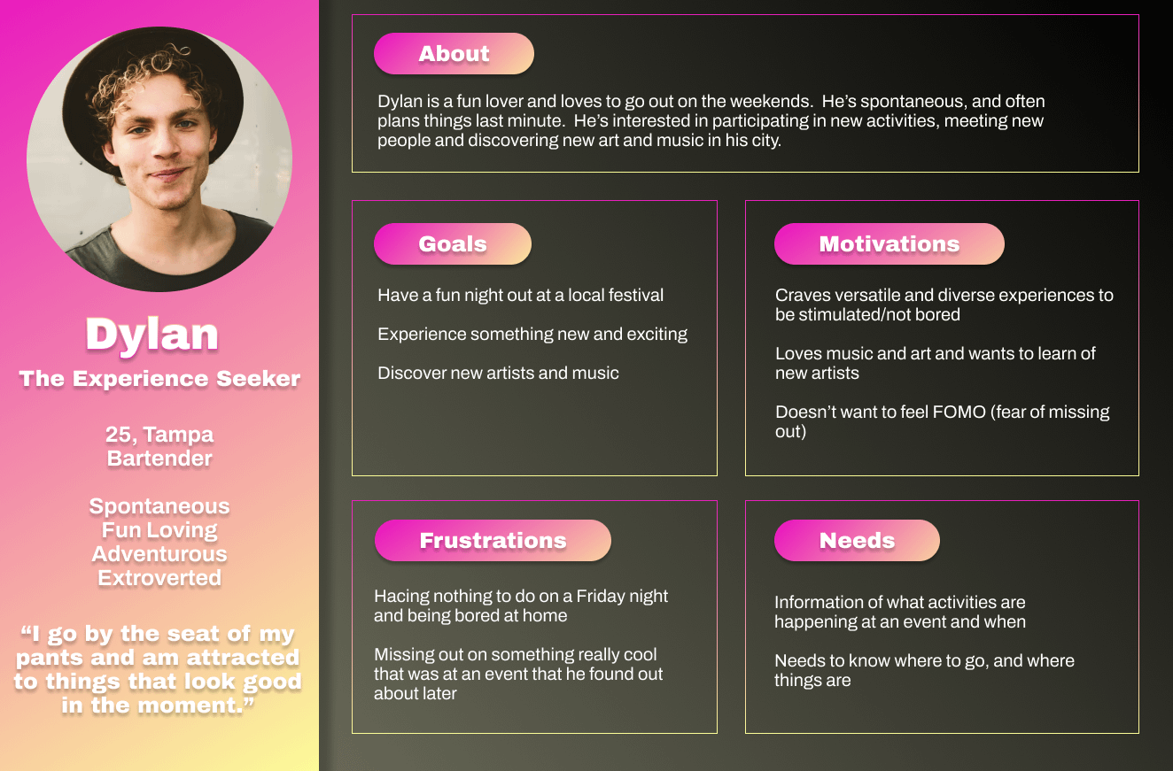
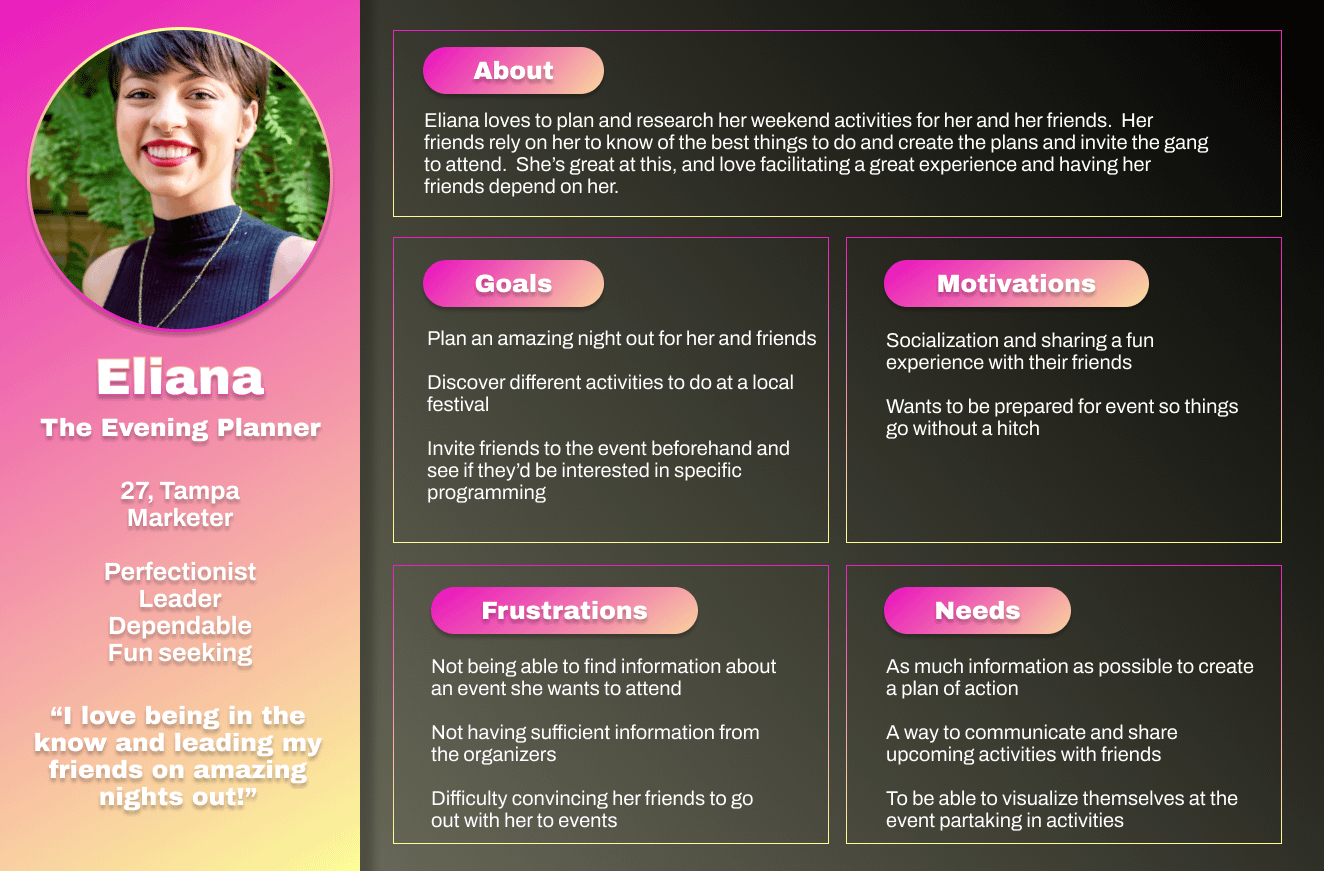
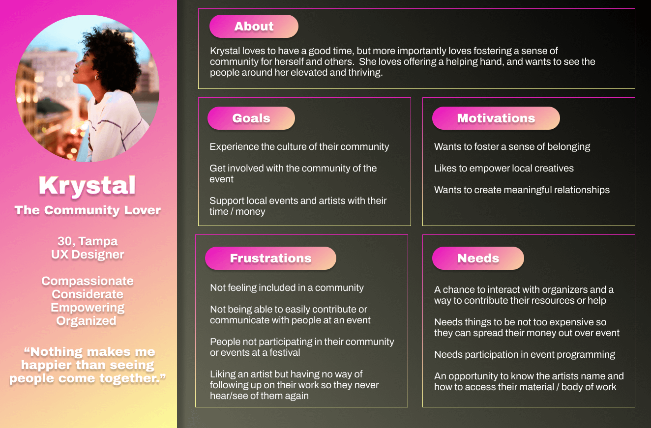
Developing Personas to keep our designs human centered
Once I had my users’ needs defined, I created personas to keep real people, with all their strengths and limitations, in mind as I designed solutions to their problems.
I found that these personas generated a lot of empathy from people outside the team, especially when presenting to stakeholders and potential sponsors. Many could see themselves in one of the roles.
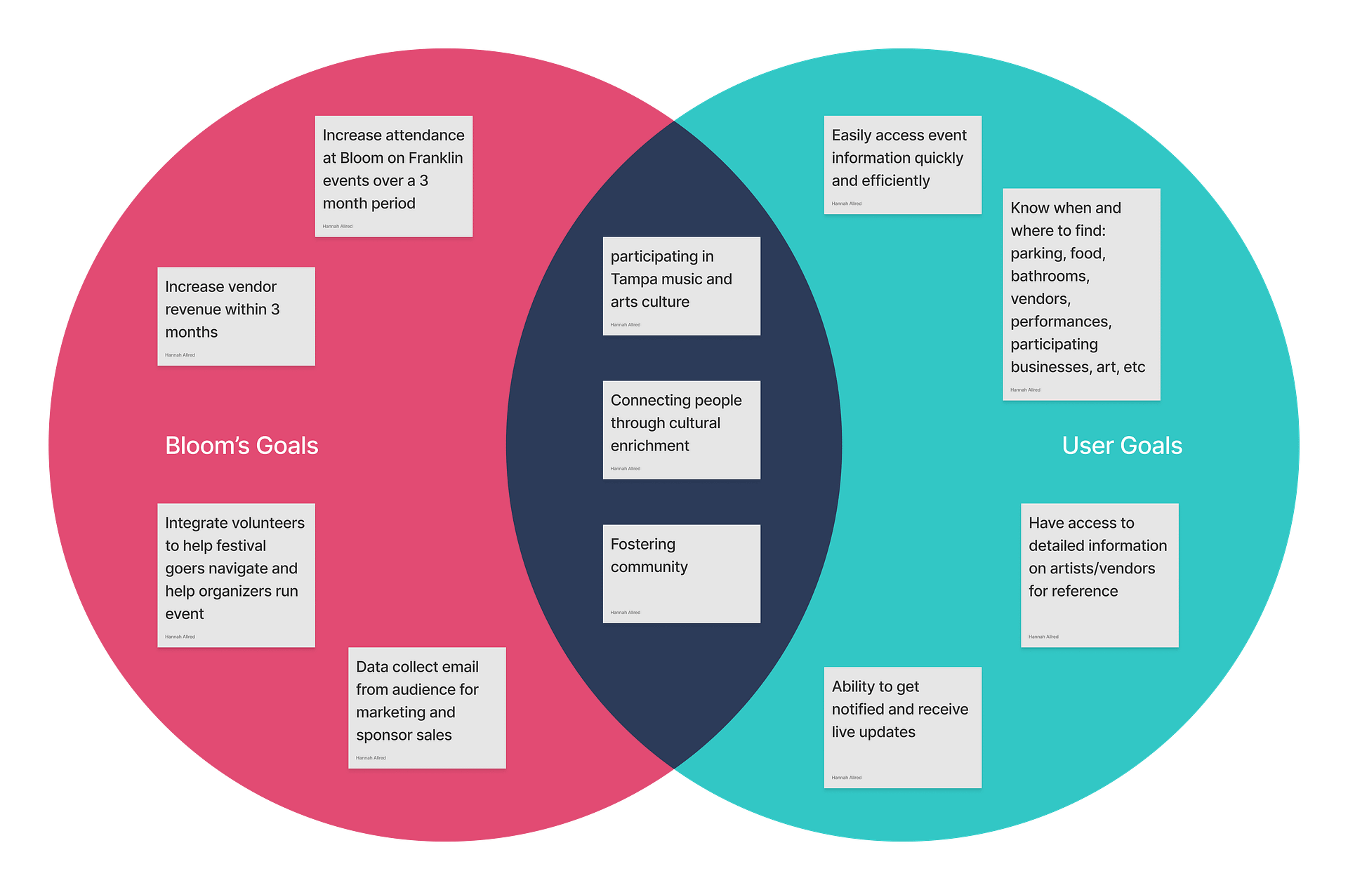
I broke the personas out into 3 types of users so the product could fulfill different needs.
The first user is a casual user, needing to simply know the when and where – preferably quickly, maybe last minute.
The second loves to plan, and wants access to as many details as possible, perhaps having over all higher expectations.
The third is interested in connecting with the event and the people involved, and needs a way to do that efficiently.
Determining User and Business Goals
Ultimately, my design needed to fulfill both the users’ and Bloom’s goals. I created this diagram to keep those goals in mind while ideating features for the website and over all systems for Bloom.
Prioritizing design features
I came up with many ideas of possible features for Bloom’s website, but decided to focus on a few that would best meet the user’s needs, and achieve key business goals. I knew Bloom was limited in scope in time, updatability and budget. What the users needed also needed to be easily created by the team, and valuable for the business, too.
Here’s what I knew Bloom needed:
A Schedule of activities, and when and where they occur.
A Map of the locations, and where to find resources like bathrooms and parking.
Updated website home page, call to actions, and navigation to make information finding easy and CTAs more prominent.
User data collection for email marketing and text message campaigns to facilitate direct communication between the organizers and audience
designing a product fit for a festival
Research, check. Defining our design goals, check. Knowing what features I need to add, done! Now it was time to design this thing! I wanted to fully flesh out this project with deliverables Bloom could use not only for this project, but any iteration of this idea they might have down the line. I had to remember, the goal was to grow and have a product that could scale.
Updating the Information Architecture with a new Site Map
Bloom’s navigation and information architecture needed a reboot to make the site useful for their audience. I used the mental models uncovered in my card sorting research to make the necessary information on the website easy to find.
Here’s what their original website looked like.
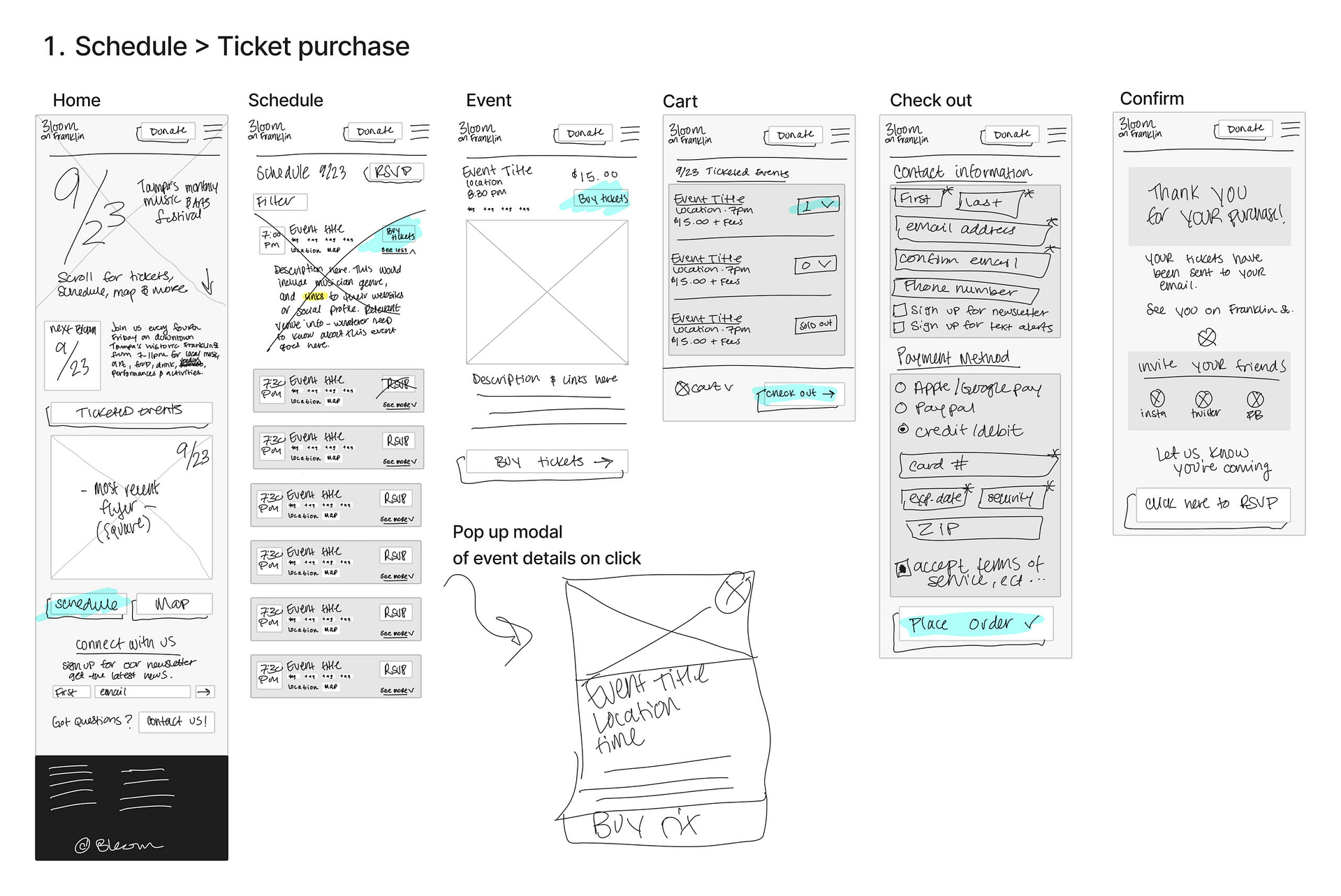
Sketching screen flows
I sketched to see how the user’s might experience Bloom’s website, page by page, on their mobile device. I focused on the schedule and map pages, since users would be interacting with these the most.
I ended up cutting the payment portal flow, since this wold likely be handled by a third party like Eventbrite.
My map changed quite a bit from sketch to prototype. The original flow had a user using the map to buy a shuttle pass.
When it came to the final prototype, I found users’ need to find parking more important, so that was the flow I designed and tested for.
These sketches ended up facing a lot of revision to make the map and its dialogue more streamlined.
Digitizing sketches into mid fidelity wireframes
The mid-fi wireframes were important in determining placement of elements on the pages.
They underwent many revisions after meetings with team members and stakeholders in order to make sure they were ready to go from mid-fi to high-fi.
There were stylistic changes between the mid-fi wireframes and finished prototype, especially to the map screens.
I designed mid fidelity desktop screens, but when it came to developing a working prototype for user testing, I decided to only render the mobile version in high fidelity. I knew most of Bloom’s users would be interacting with the site on their phones, probably from Instagram, especially during or right before the event.
DESIGNING A BRAND to GROW WITH BLOOM
This was the most fun part for me: a total redesign of Bloom’s brand.
Bloom’s logo and visuals needed to be rebranded for more memorability, but before that, I wanted to work with their team in coming up with five key brand values to work from, informed by my user interviews.
Leading with Love
Nurturing Inspiration
Building Community
Uplift Diversity
Fostering Growth
Some logos that didn’t make the cut.
Refining their logo
Bloom originally had a very ornate word mark utilizing a styled text, but some A to B research proved that a sans serif font was easier to read and remember.
I made use of the trail and marker theme from the old logo, and gave them a marker exclamation point that was unique to their brand.
I used the original ornate font in the circular icon logo. They could use this for letter heads, social media icons, etc. The exclamation-heart tied the variations together.
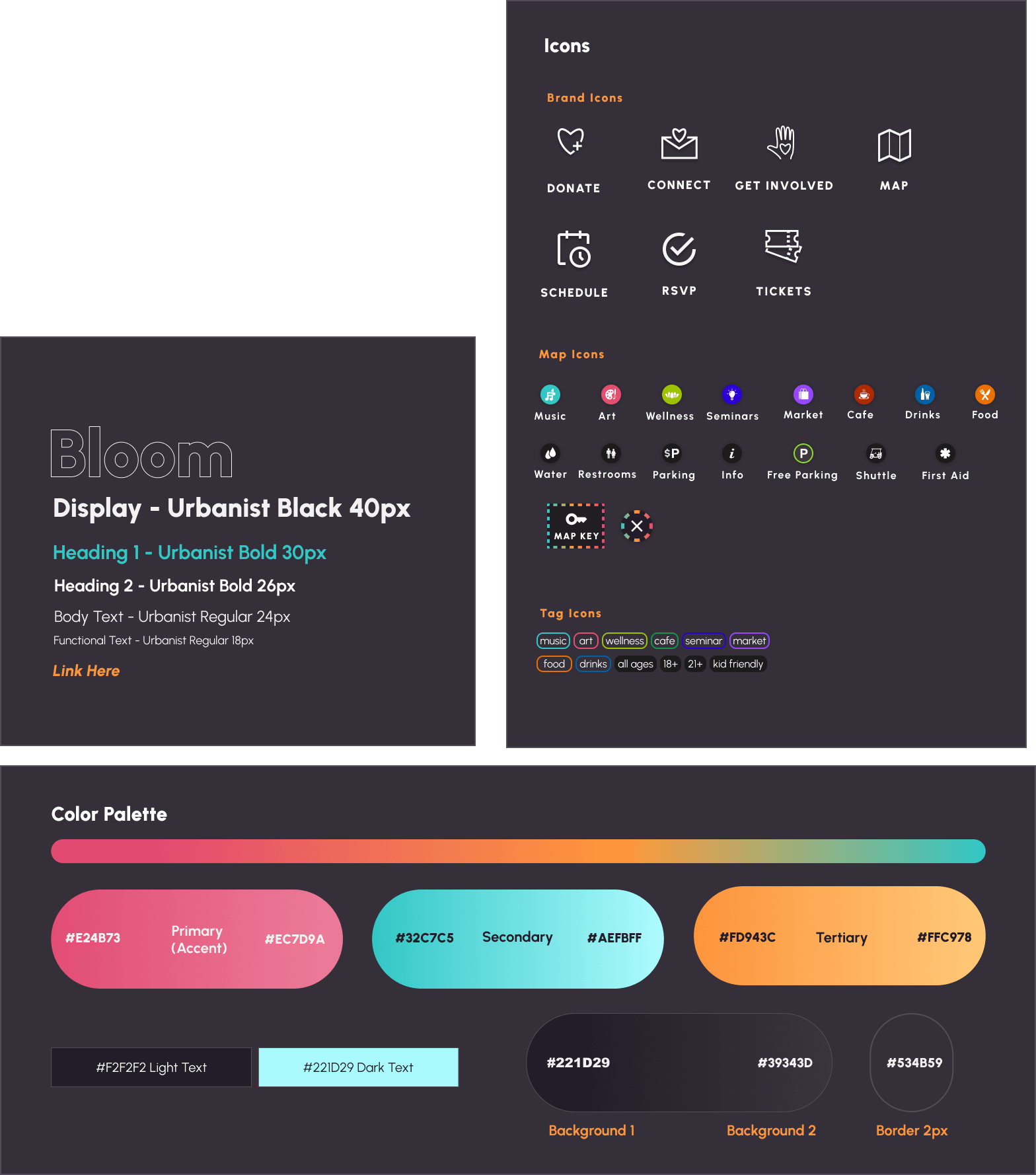
Developing a new UI Style Guide
When it came to color, I didn’t want to drift far from Bloom’s current branding.I updated the colors of this nighttime festival with a sunset style color palette.
They would need icons for their home page as well as for their map, so I made those as well.
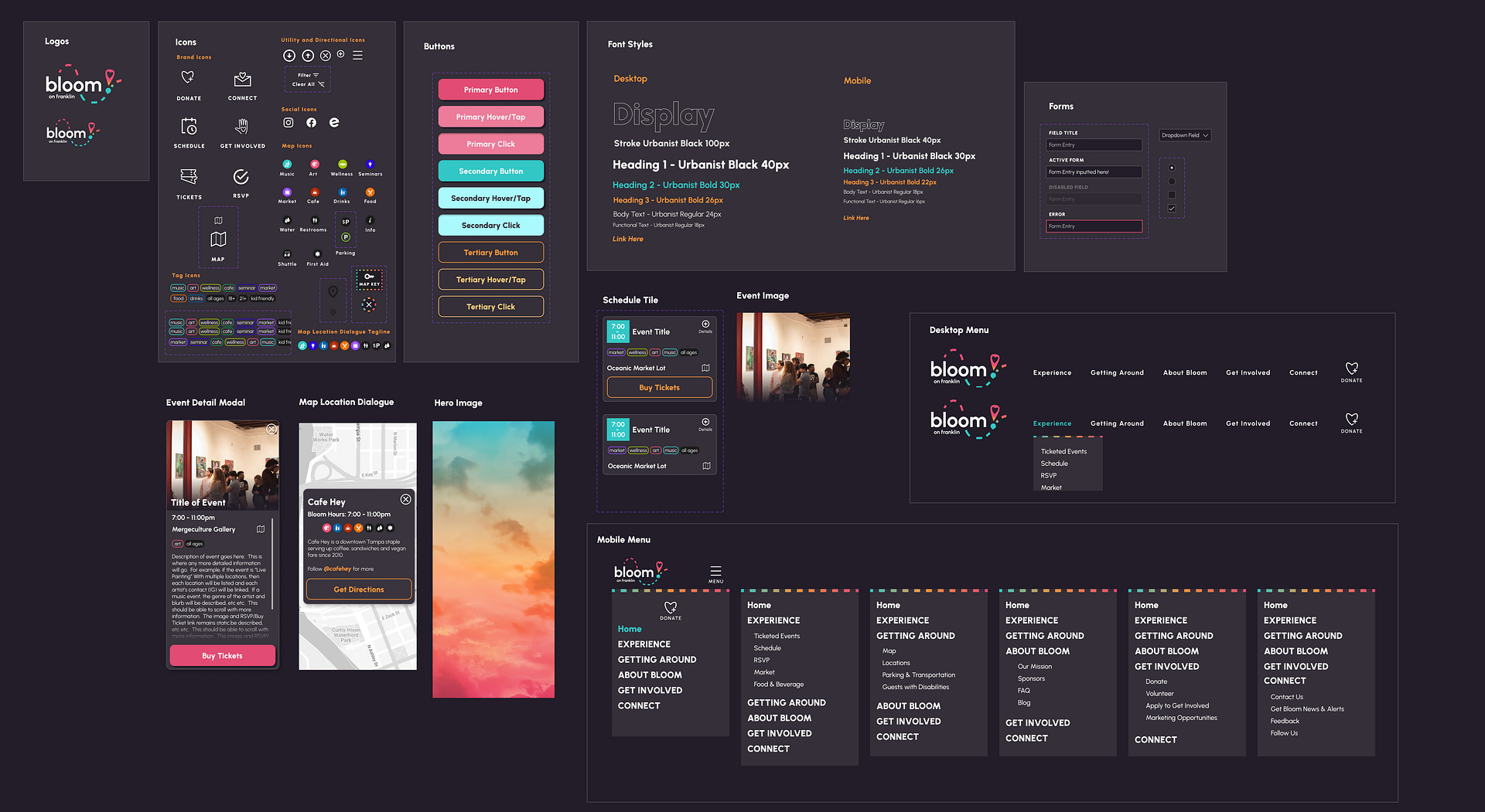
Creating a UI Library using Components
I took the time to create a library with relevant components to save me tons of time while building out the website prototype.
CREATING A HIGH FIDELITY PROTOTYPE
I had all the pieces to build the product. It was time to start creating the mobile first website prototype.
I created screens for the homepage, schedule and map features that would be used to perform usability tests on those features.
Building a homepage that users find useful
The new homepage makes use of CTAs for the Schedule, Map, RSVP, Getting Involved and Staying Connected. This helps the users find everything they’re looking for at the very start of the experience, and makes it easy for users to meet Bloom’s goals in more ticket sales and email/phone number collection.
Promoting all of Bloom’s activities with a schedule
The schedule design is separated by time and zones so that users view proximate activities at this linear street-based festival. Colorful tags quickly transfer information at a glance. CTAs to purchase tickets, view map and access details make it easy for users to engage with events that peak their interest.
Putting users on Franklin Street with a map
The map was the most challenging and iterated design. I eventually landed on a map key button that opens an overlay explaining the map. When users click on an icon, they are given more information about a location. CTAs to get directions from users’ local map app make their appearance in dialogues.
checking our design with usability testing
I needed to see how the features performed, so I set about conducting usability tests.I utilized Optimal Workshop’s first-click chalk mark test with extensive post-task questions to gain insights from the users remotely.I recruited participants from my interviews, as well as others who had no previous knowledge of the project.All the testers could be defined as Bloom’s ideal audience.
Task 1: Find out what time the East Forest concert starts and ends, and read details about it
Task 2: Use the map to locate where there is free Parking near Yellow Brick Row
Usability Testing Insights
Test subjects were able to successfully finish the task related to the schedule 5/6 times.The schedule and event details modal were meeting our users’ needs well.
Many people utilized the Schedule and Map CTAs on the homepage to navigate.
Menu options like “Experience” and “Getting Around” were intuitive enough for users to find the information nested inside them.
Upon first viewing the map, most users failed to find the free parking icon versus the paid parking icon.
The map key cleared up all the initial confusion about the map and its icons, leading to a 100% success rate of the map based task.
Users were missing the date of the event on the homepage, likely due to the stylized stroke text.Some users also recommended adding an overall event time frame to the home page.
PRIORITIZED ITERATIONS
I replaced the stroke text with a bold fill, and included a written out date instead of a numerical date. I also added a time frame so users had the most important information upfront.
This will make the site more usable for all users, both planners and casual glancers!
I added a price to the ticket CTA on the event details modal to save the users a click in knowing how much a ticket costs. I felt like this was an easy add, and would help instill trust with the users.
I updated the paid parking icon to feature a money sign to clear up confusion about locating parking at a glance, and added a search bar to the map so users could find things without having to click around if they had something specific in mind to look for. I knew this might be helpful for more casual users like our persona, Dylan, who needed to find things quickly and easily.
creating a user-focused social media strategy
Bloom’s users interacted with the brand mostly through Instagram. I couldn’t ignore this, especially since Bloom would be operating again before a new website could be built.
I applied what I learned through the design process to their social media strategy. Here’s how I helped grow their IG by over 300 followers in a month, increased their reach over 100%, built their volunteer program, and helped them achieve record ticket sales for their 2023 season.
Introducing the new brand early
Bloom’s users would realize a change in branding, so I knew some fresh introductions were in order. I made a point to introduce the new logo and reiterate the brand’s values months before their next event was to take place so users could adjust accordingly.
Users responded very positively!
Presenting clear ways to get involved
I made sure to engage the community early on to make this donation based festival run smoother. Having volunteers help on event nights made a huge difference to Bloom’s success and flow for its staff.
Utilizing Reels to expand reach
I worked with Bloom’s videographers to create reels using Canva. We’d create reels for the line up drops 1-2 weeks out from events and post recap reels a week after events to keep reach high all month long.
Creating captions to promote engagement
I made sure all of Bloom’s captions spoke to users in a way that would encourage them to engage with Bloom directly, by commenting, sharing, liking or saving posts. Posts weren’t just informational, but gave direction to act.
Changing ‘RSVP’ to ‘Get Tickets’
In the shift from market / art walk to festival, I knew ‘Tickets’ would be more familiar for users. Additionally, “Get Tickets” would create more urgency around clicking the link.
Even though users could still get a free ticket on Eventbrite, more users were now visiting the Eventbrite ticket link and seeing options to purchase a donation ticket, as well, leading to more sales over all.
When the CTA was “RSVP”, there was no sense of urgency to act and click the link.
Implementing a schedule
Much of my product design revolved around a schedule. Users wanted to know what, when and where things were happening.
It would also help us keep our musicians on time!
We posted the schedule on IG, and also printed them out for the night of!
Guiding with a map
Since users were concerned with where to find things like bathrooms and parking, I made sure to create a map that could be shared on social media, as well as printed the night of.
This helped tremendously, as more people visited the more remote locations because of the map!
Making it all come together
I helped run Bloom’s Instagram for 3 months, developing captions, posters and reels to promote their festival from an informed UX perspective.
These changes shown here were just the tip of the iceberg – many smaller interactions took place that put the audience first and grew Bloom’s following and user trust.
I was happy to come on and do this task for my friends, but will be happy to hand this role over to a social media management pro during the next season.
While I love collaborating with local artists on poster design and providing direction for Bloom’s marketing materials artistically, I’d prefer to spend my time on UX strategy and design than work on managing a brand’s social media platforms.
Needless to say, I’m happy my design work was able to be put to great use!
FINAL THOUGHTS
This project was super fun, and I would be happy to team up with Bloom again in the future.
Being able to design from the ground up for such a fresh brand grew my skills exponentially, and for that I’ll always be grateful for Bloom. I learned so much about the design process from start to finish during the course of this project, as well as what it meant to work with a team and collaborate. I was so happy that Bloom trusted my eye and design thinking to bring them a product that would scale with them over time.
While Bloom hasn’t received the budget to implement these designs on their website, I applied the new branding I’d done to their instagram page and worked with them to create a user centric social media campaign based on my user research findings.
As a result of my work, their social media following exploded, and their attendance during their 2023 season, as well as their donation-based ticket sales, were higher than ever.
Bloom is now in development to transition into a quarterly or yearly event, so stay tuned for more!
“Hannah’s work went far above expectations in UX development for Bloom; we structured all of our operations around her findings, changing the way people use technology to support the experience at our live events..”
Every month I release a newsletter on the new moon. Sign up here to receive public art updates, new releases, merchandise, invites to exclusive art events and more!

